

Curate, Don't Collect Paint
FTC Disclosure: Please note that some of the links in this post are affiliate or referral links (full disclosure here), and if you make a purchase or sign up for a service within a certain timeframe after clicking on one of those links, I may earn a small commission paid by the retailer at no extra cost to you. I wouldn't recommend anything that I don’t or wouldn't use myself. Thank you for your support!
Some artists, especially those who are just starting to dip their toes into the medium, find themselves fighting FOMO and the temptation to buy every single paint color available. I don’t blame them - in fact, I’ve gone through the same thing in the past. The colors are so pretty, and why should I figure out how to replicate the color myself if I can just buy it, right? Here’s one good reason…
It is so easy to get caught up in the rainbows of colors of neatly laid out paint tubes or swatches or massive paint boxes full of color, because it’s like a box of potential. So much potential… Once I delved deeper into painting and started connecting with other artists, I started noticing the disparities between the commercialized influencer art world of today and the one that I grew up in before the age of the internet and social media, when your access to new art supplies was browsing through your art teacher’s Pearl Paint catalog or loitering in a tiny, dusty, privately-owned art shop in a seedy part of town. I’m not talking about Michaels or Hobby Lobby - those existed as well, and I shopped there too, but those were primarily craft supplies. The art supplies they carried were fairly limited, and some things they didn't carry at all. Last I checked, things haven't really changed.
I’m not saying that the new artfluencer is any less of an artist, or that the new direction of the artist-identity is any less valid than previous ones. It’s just a difference that I’ve noticed, between the reclusive artist-elders I’m familiar with and the extroverted social media art world that I’ve tried to fit into (I just can’t get into it) - that being said, there is definitely a very strong pull to buy all the things that comes with the latter that I really need to be mindful of. It just shows how good they are at marketing what used to just be a non-descript tool of the trade. Art supplies getting the same treatment as designer brands? That’s new.
I don’t intend to tell you what to do or not to do (and I wouldn’t shame you for collecting them all, if that’s what you really want to do) - after all, it’s your money and your art. Instead, I wanted to share how I went from getting caught up in FOMO to being far more selective in which paints I purchase by choice. I don’t feel like I am missing out on anything. I do get dot cards (the only ones of artist-quality paint that I’ve found are from Daniel Smith, Schmincke, and Windsor & Newton) or samples whenever there is one available for a brand just so I can have on-hand swatches, but I have found peace in letting go of my art supplies (or passing them off to my kids if it’s something they want) and taking a more minimalist approach.
In case you wanted a quick bullet point list as to why I have no interest in collecting all the paints before I go into more detail, it comes down to these points:
Convenience colors - why pay extra for paint that I can mix myself, especially since many convenience colors use fugitive pigments? Not only can I get a near-perfect match, but my mix won’t disappear or shift in color over time. Either I’m a control freak, or I love the challenge. Or both?
Fugitive pigments - I’m done throwing money at paint that will disappear on me like invisible ink.
Chemically unstable pigments - this depends on the paint, some are okay, some not so okay.
Cost-prohibitive - Some of us don’t have the expendable income of social media influencers.
Inventory space - Clutter stresses me out. Even if it’s stuff I love, if it’s too much, I get overwhelmed.
Decision fatigue - I have ADHD, which means I need to be careful about the things that drain my mental energy. I simplify where I can.
A quick note on how I reference paint in my notes: I prefer using pigment numbers over names, because it’s easier for me to remember. The pigment is what is standardized, while paint names are what brands decide to call them. Brands often differ on the name for the same pigment. Brands also differ on formulations for the same name/similar colors when it comes to convenience colors. This way I know what I’m working with, which helps me to obtain consistent results.
What are convenience colors?
The paints you purchase are either a single pigment, or a mix of pigments to create a convenience color. There are also hues, which are also made up of multiple pigments, but are meant to replicate a single pigment paint. This is something you’ll find more frequently in student-grade paints than artist-grade ones, especially if they’re using cheaper pigments to replicate a more expensive one. So, if you see the word hue mentioned in the name, know that there is a single pigment paint out there it is attempting to replicate.

This is where my practicality kicks in. Unless you have a specific convenience color from a specific brand that you find yourself reaching for consistently, I don’t see the sense in purchasing a convenience color when you could easily mix that paint up on your palette. Most convenience colors use a mix of the same go-to pigments - you can arguably save hundreds of dollars just by learning which pigments make up the convenience colors you enjoy painting with or see if you can come close with the ones you already own. I’m not militantly against the use of convenience colors. I just don’t have that kind of budget for art supplies. If I have extra money, I will use it on maybe two or three paints tops, after extensive research on whether or not it would make a significant improvement to my palette, or those which I have been looking forward to experiencing (like the electric blue PB33 above, which has long been discontinued except being minutely present in Old Holland’s paint along with three other pigments, so when I saw an indie maker which I’ll share in a future post selling pans of it, I didn’t think twice about purchasing it).

Due to the separation of moonglow’s pigments, each sample I’ve painted out from the pan I poured out at least a year or two ago is slightly different. In fact, this is the most purple of the samples I’ve gotten, whereas previous swatches I’d painted out while improving my mix more closely resembled the one at the top, while prior mixes of mine looked more like the bottom. Figures it would be on the page that I make to show where I finally got my mix to look like prior samples that moonglow has to embarrass me with its pinkish purpleness like this. If you like this version of moonglow, just add a touch of PR122 to the mix. At least you know, no matter what variation you get, it’s a match, because even moonglow doesn’t match itself consistently.
But the cost isn’t really my biggest concern with convenience mixtures - it’s the issues with them being lightfast. Why manufacturers still insist on selling fugitive pigments, let alone mixing them into other colors, I have no idea. For example, above I show you that it’s absolutely possible to recreate Daniel Smith’s Moonglow using lightfast pigments. Why they opted to use the fugitive PR177 instead of one that is more lightfast, who knows? They are neat, but they don’t last, so it’s a waste of money. The fact that they also include these in starter sets means beginners have to relearn how to mix colors later on if they want to move away from the pigments that disappear on them if they’re put up on the wall.
Note: You can use PG7 or maybe try PG18 in place of Amazonite. Daniel Smith’s Moonglow uses PG7. I don’t have either PG7 or PG18, but Amazonite is pretty close to PG7, so that is what I chose to use. Side note: I am aware of the Daniel Smith Primatek controversy, but it seems like there’s a bit of “extra” going on in the call-out. As one of the comments in the link pointed out, Pthalo pigments are staining (which is what PG7 is), whereas Amazonite is not. It’s definitely nowhere near as intense or heavily tinting as Pthalo pigments, and so if using a Pthalo for the moonglow mix doesn’t work for you (they can be really tricky to mix), that’s why I suggest either trying a PG18 that’s a bit more blue-ish, or trying Amazonite. Back to DS, if they added something to some of them, I wouldn’t be surprised at all. The question of how much mineral content is present isn’t new. There are other paints that they don’t disclose all the components either, which I address below. I don’t need to be a geologist to know that Amethyst is not that intense of a purple, though there’s clearly some in there due to the crystal sparkle of the paint that isn’t like micas, and the paint is rated lightfast even though Amethyst on its own is both fugitive and chemically unstable. If they do this with all of them or just “boosted” a few, who knows. I already had my paints before becoming more selective about my palette, so the lightfast ones I will continue to use until they’re gone, and I’ll decide from there if I’ll continue using them or switch to something else. You know, maybe I should set Amethyst aside just in case and do a light test on it… While it is important to research your paints, some of these actually do work really well. I love mixing with Amazonite, and it’s not that expensive of a paint compared to the other Primatek ones. Even if I don’t know if they’re being completely transparent about it, so as long as it’s lightfast, and I find a particular mineral paint to be useful in my palette, it shall remain.
One of the things I’ll be doing in future posts is going through the dot cards, and if a convenience color is safe (meaning it uses lightfast pigments), I’ll mark it as such, and if it is fugitive, I’ll share how to recreate them easily using pigments that are lightfast. Like I said, I don’t personally have an issue with using them. I don’t, because I like the control and ability to mix my own, and it’s less for me to keep track of. I don’t want the extra clutter in my palette, and I’ll explain that later on. I do understand why people would opt to use them, and I don’t think it makes them any less of an artist to do so. I just don’t like that they’re getting screwed on poor quality paint with the kind of prices they charge per tube these days.
What are Fugitive Pigments?
Many of the pigments that are offered in watercolor paints are what is known as fugitive, which means that they will fade with exposure to UV light. Some will fade more than others, and some will disappear rather quickly within a short span of time. This is why there is a lightfast rating on paints, but unfortunately due to the way they are tested, this isn’t always accurate. There are a number of occasions where a manufacturer will list the lightfastness of a paint higher than it really is.
If you would like to know whether or not it is worth investing in a paint before purchasing, I highly recommend the following sites to help you with your research:
Handprint’s pigment database (the links to color families are at the top of the page)
Art is Creation, which has notes on each pigment and links to other references (including Handprint’s)
Kim Crick does extensive lightfast testing on all the brands, some are still a work in progress, but there is tons already on her site. Her ultimate palette list is also incredibly helpful to build your own. (Handprint has a few too.)
Jane Blundell - I haven’t seen as much about testing lightfastness, but her comparison charts are really helpful to me to get an idea which lightfast pigment best matches one that is fugitive when I come up with my own mixes.
PS. If you, like me, thought fugitive meant a painting would take years to fade slowly over time, and this was something you could live with, because you don’t expect your art to be relevant that long, this really devalues your hard work. Just like art teachers drill into your head to always sign your work, always, use archival materials whenever possible, and use paints that won’t fade over time. After all, nobody knew Picasso would become Picasso when he made those sketches, right? Many artists were ahead of their time, and didn’t become valued until after they were gone. Obviously, we all won’t be the next Picasso (I mean as a famous artist whose name most people know, because he was a bit of an asshole as a person) or famous-once-we’re-dead, but my point is, don’t sell yourself short before you even have a chance. Don’t devalue your work. You worked hard on something, that matters a lot, and you should be proud of it.
It sucks, of course. I have several colors that I love that I wish were lightfast but aren’t. Those will have to be sketchbook-only paints to play with, but unfortunately will not get a place in my main work palette.
Chemically Unstable Pigments
There are other pigments out there that may be UV stable but are not chemically stable. Things like humidity, air pollution, even the binders/additives used to create the paint, or in other paints that are mixed with that one can affect the color of the paint in the long run. Instead of fading, you end up with color shifts, or yellowing over time. Some pigments unfortunately will change with time, no matter what you try to do to prevent it from happening. This may or may not be something that bothers you.
Your mileage may vary. For example, Sodalite is one that shifts in color a bit in the pan or tube over time, but it doesn’t change once it’s been used in a painting. I am personally okay with this, and I have decided to keep this paint in my palette anyway, because it’s the closest thing I have found to a lightfast indigo out of the pan. As long as it stays the same once it’s on the page, that’s what matters to me. The point here is to do your research on what you decide to use in your art.
fluorescent additives

A pigment may be lightfast on its own, but the moment an optical brightener (fluorescent additive) is mixed in, the paint is no longer reliable. You need to do your due diligence with this, as the optical brighteners are not listed on the tube with the pigment, but the name will give it away. One example of this is Daniel Smith’s Opera Pink (which I have, since it came with a set that I got). The only thing listed as a pigment on the tube is PR122, however you can see in my sample that there is a noticeable difference between Opera Pink and Helios Purple (which is also PR122, but with no optical brighteners added).
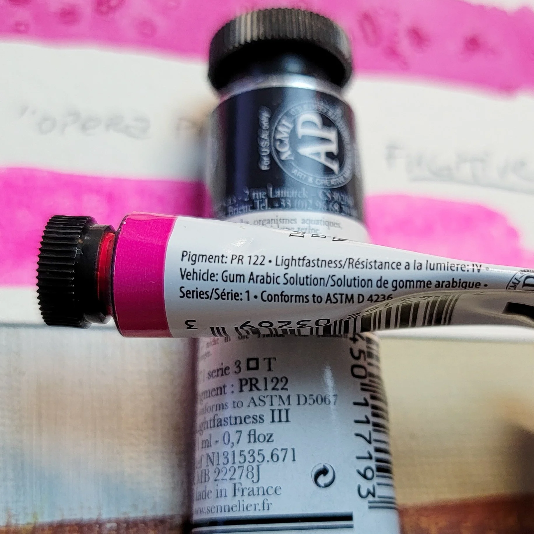
Kim Crick’s tests show that Opera Pink will fade almost entirely with sun exposure, even though PR122 is lightfast. This is one where manufacturers underrate the lightfastness, which on its own has been proven to be more lightfast in independent tests than fugitive red/magenta pigments that are rated higher. I find it incredibly misleading that they do not list the use of optical brighteners on the tube (I’m not sure if Daniel Smith is the only one that doesn’t, as it is the only example I have). Sure, they could argue that it’s in the name “opera,” but when I see opera, I think of classical theatrical productions, not invisible Lisa Frank.
It depends on the purpose of your art and how long you want it to last. If the intention is to make some fun UV-reactive paintings for a room with blacklights, go for it. If you’re trying to make something that will last a good while, I’d consider skipping the neon.
Cost is a factor
I covered this a bit in the section on convenience colors, but I don’t have much in the way of expendable income for art supplies. I make some money off my site, but that’s mainly enough to pay for the site, plus a little extra side cash to help with essentials, especially with the issue of global inflation and OPEC’s nonsense that has led to gas prices that are practically unaffordable. I know that everyone is feeling the increase in costs right now without the increase in pay to help cover it. We have all experienced what is essentially a pay cut (when pay doesn’t increase to match the sudden increase in cost of living), and many of us were a bit tight on funds to begin with.
This means that even if I did want to buy all the paints, I couldn’t afford to. By being more selective with my art supplies, which paints I choose to invest in, and focusing on those which I can use to mix many other colors, I maximize the value I get out of my paint.
Storage
One of the fairly recent revelations that I’ve had for myself, as someone with ADHD, is that I get very easily overwhelmed by having too much stuff. I used to think that having a lot of things didn’t bother me at all, that I do well in a sort of organized chaos, that I preferred it. As it turns out, the organized chaos is a result of my not being able to handle having too much stuff. I am too overwhelmed to handle the stuff, so it becomes chaotic.
This includes art supplies. Most of the things that I’ve accumulated over the years are art and craft supplies. First, I had to declutter my hobbies, and then I had to become more selective about the supplies I keep for the specific hobbies or passions that I’ve decided to hold onto. This also means not buying more things to replace the things I’ve let go of, unless the goal is to curate and choose better quality supplies (at which point I get rid of all the lower quality things, of which there would be more, and slowly invest in higher quality items one at a time). The last thing I need right now are collections of paint sets.
On top of that, if I were to use the paints, they take up space on the palette, so my palette becomes visually cluttered as well. A messy palette where I mix lots of colors is fine. A palette full of so many paint pans that I have no idea which is which would be far too overwhelming for me.
decision fatigue
The concept of decision fatigue refers to what happens when you have to make multiple decisions over the course of the day. The more decisions you have to make, the harder it becomes to make a decision, and the worse or more impulsive decisions you end up making, because you’re just too worn out to think things through. I am particularly susceptible to this, so I have to simplify as much of my life as possible. This means simplifying and limiting my palette as well.
While having a palette of single pigment paints allows me to mix up countless various colors, anything that I may possibly need for my art, if I’m focused on painting and know which color green I’m looking for, I know how to mix that up quickly. On the other hand, if I have a number of greens, single pigment, convenience, plus the ability to mix up my own, it’s possible that I would get stuck here and just walk away from it to come back to it later. This is fairly disruptive to my work process, and in this case, convenience isn’t convenient for me at all.
